Robyn Uppercase Logo in White

Brooks & Partners

Services: Brand Strategy | Brand Identity | Brand Roll Out | Signage & Wayfinding

We were approached by the founders of Brooks & Partners, Fay & Kate, to create a new accountancy brand identity that would challenge the stuffy/generic and corporate feel associated with the “typical” accountancy firms.

Local accountancy firm brochure designs and promotional pieces
A brand to challenge accountancy stereotypes

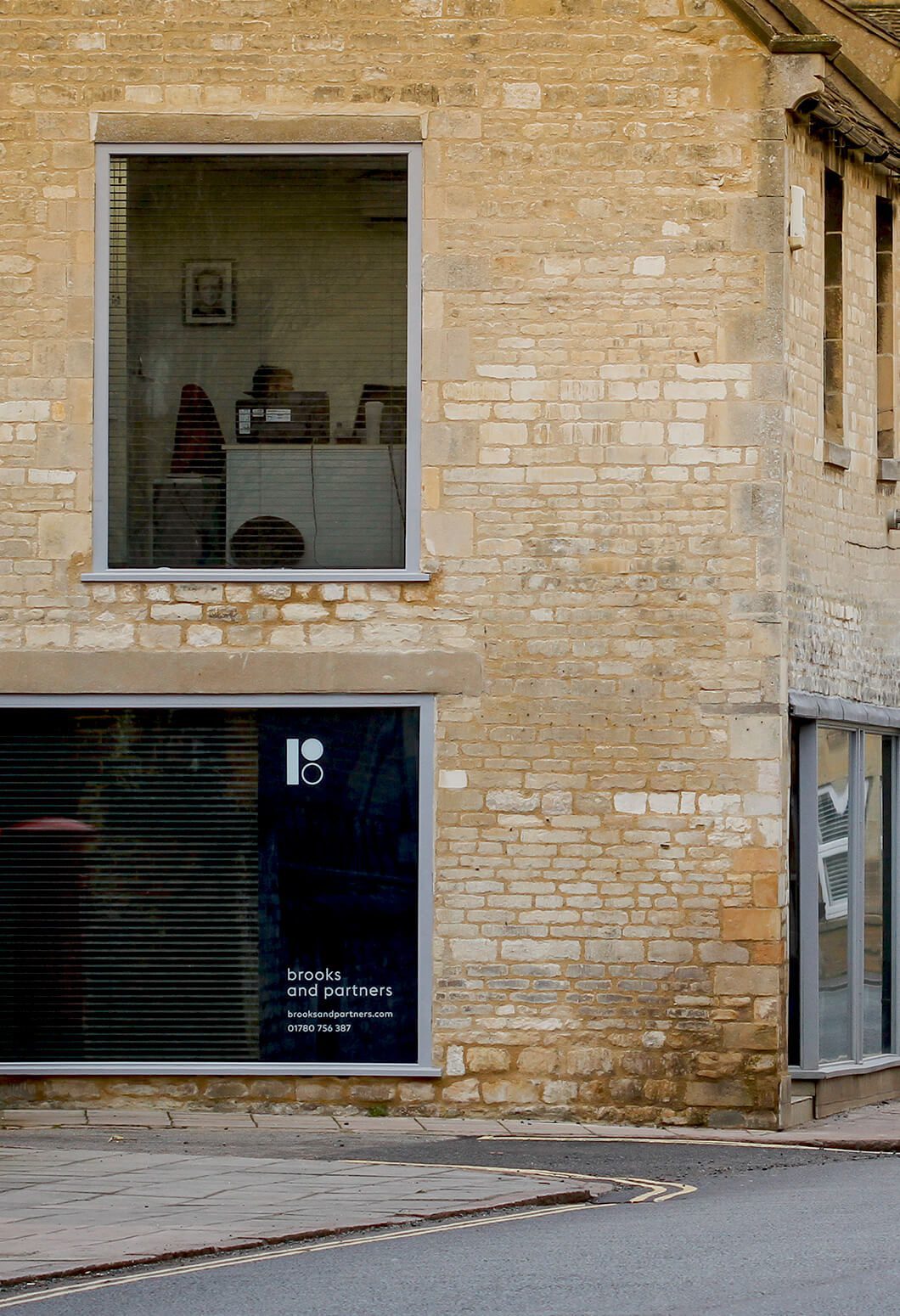
Brooks and Partners are an established, well-respected accountancy practice based in the heart of Stamford.

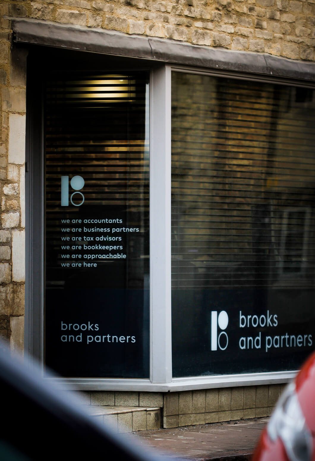
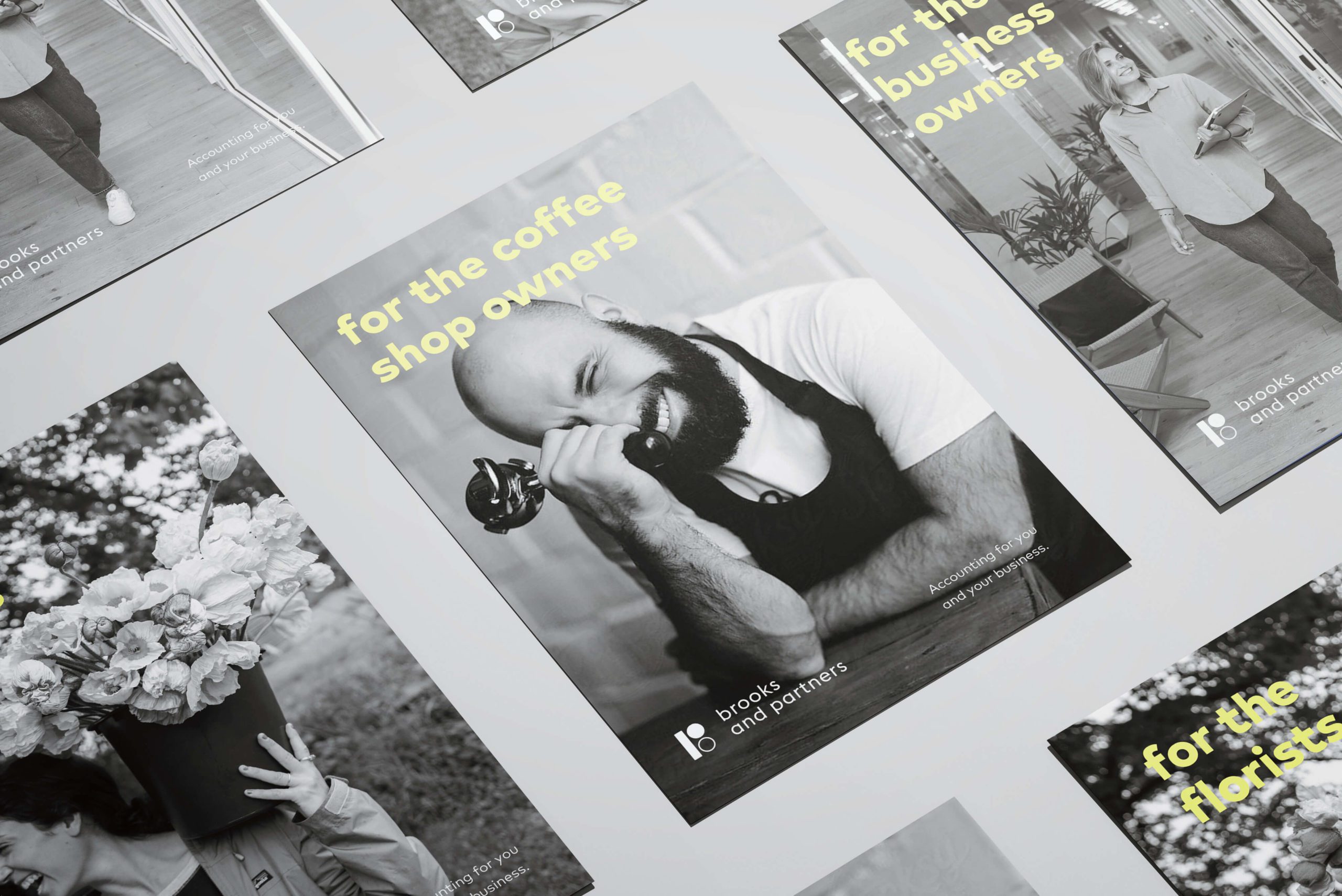
The company was created by two individuals with a shared vision, Fay and Kate, to abolish the stuffy, corporate and clinical stereotype of accountancy firms. Instead, Brooks and Partners have been pioneering a friendly, open and approachable style of accountancy that makes the world of finance less intimidating to clients and more readily accessible, promoting transparency and flexibility for each client’s needs.


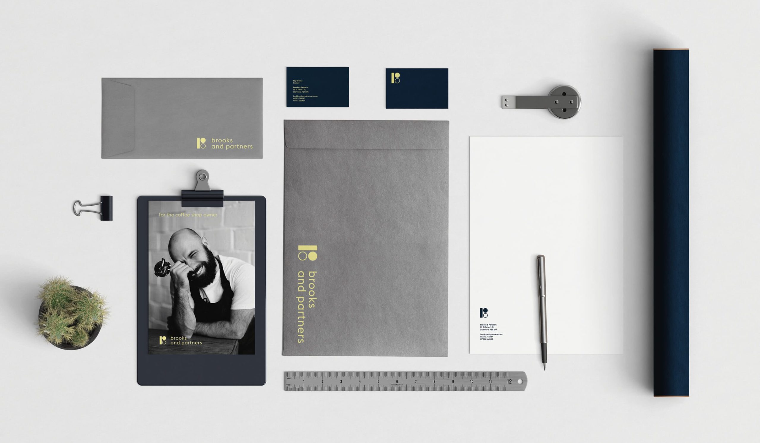
The problem they faced was not having the right brand to showcase their personality, portray a clean and professional company and promote their key values to their new and existing client base. Through the brand refresh process, we worked with the team through workshops to create a strong strategy and brand narrative that would support their vision for the company and create a unified brand that would evolve with them. We worked to create a brand identity that could be rolled out consistently, engage their audience, and develop and evolve with them as they push to be pioneers within the industry. 

Primary Brooks & Partners Accountants brand logo
Accountant branding stationery for Brooks & partners

Playful, witty and personable.

The concept portrayed a friendly and approachable side of the company through a playful and versatile design. The concept combined professional application with creative design elements to showcase the company's personality and vitality - further compounding the ‘un-stuffy’ nature of Brooks and Partners. The logo design artfully portrays a ‘B’ and ‘P’ simultaneously through an abstract block-like structure, creating a unique shape that is bold and eye-catching. Taking influence from the logo design shapes the identity was developed to reflect the quality of the company and the personal connection with their clients through portrait style imagery and a bold contrasting colour palette. Collectively, the design was crafted to lean more toward a modern, forward-thinking company rather than a generic corporate accountancy firm, and as such, imposed character, quality and professionalism through a creative and engaging design.

External signage for Brooks & Partners Accoutants
External signage for Brooks & partners

Next Project:

The Wine Bar
Primary logo design for hospitality branding, The Wine bar
Axiom
Example brand hoarding for Axiom

Next Project:

Have a project you'd like to talk about?