ENERGETIC AND PROGRESSIVE BRAND DESIGN
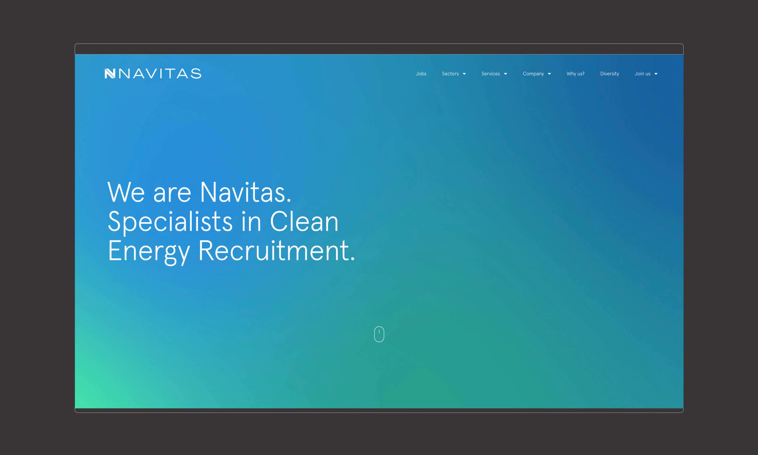
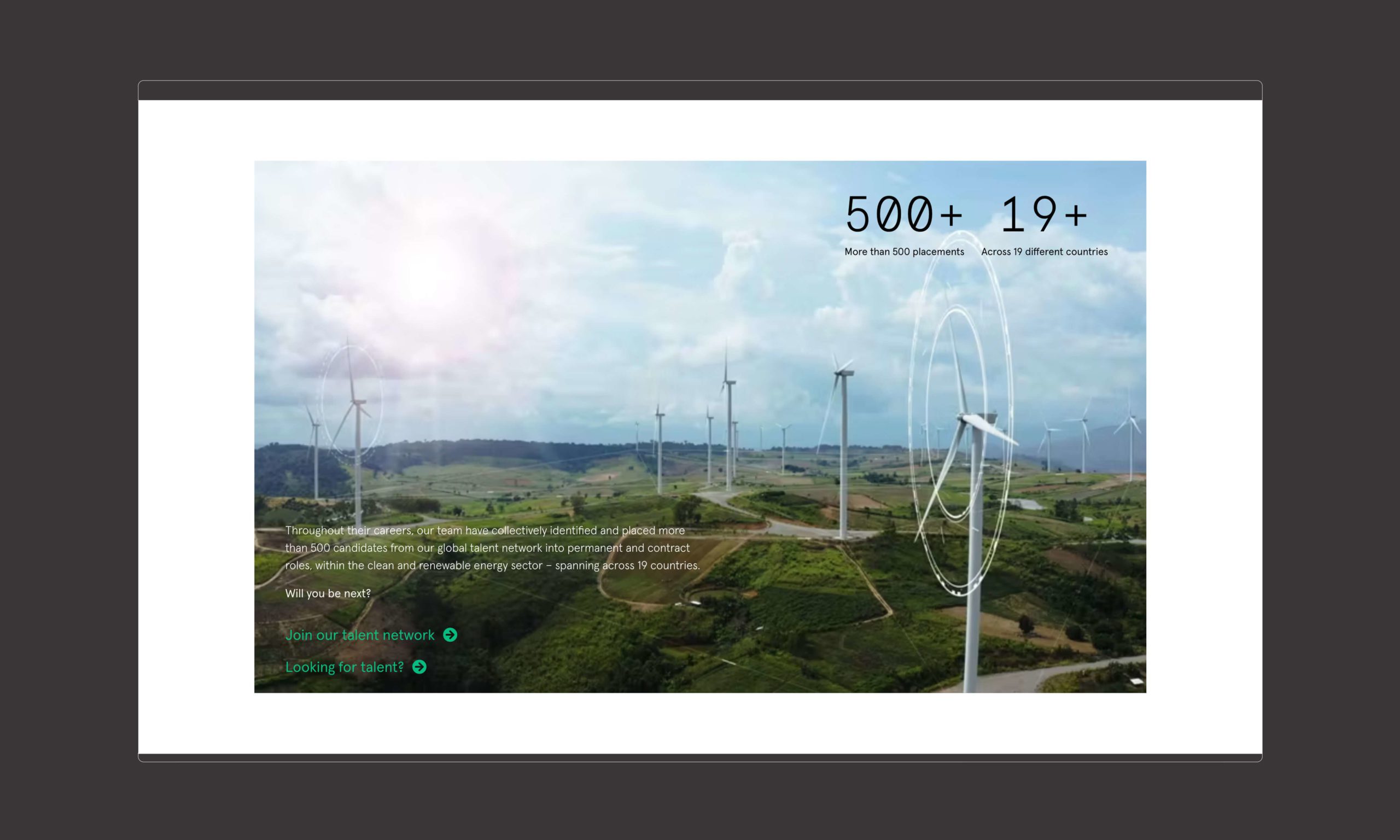
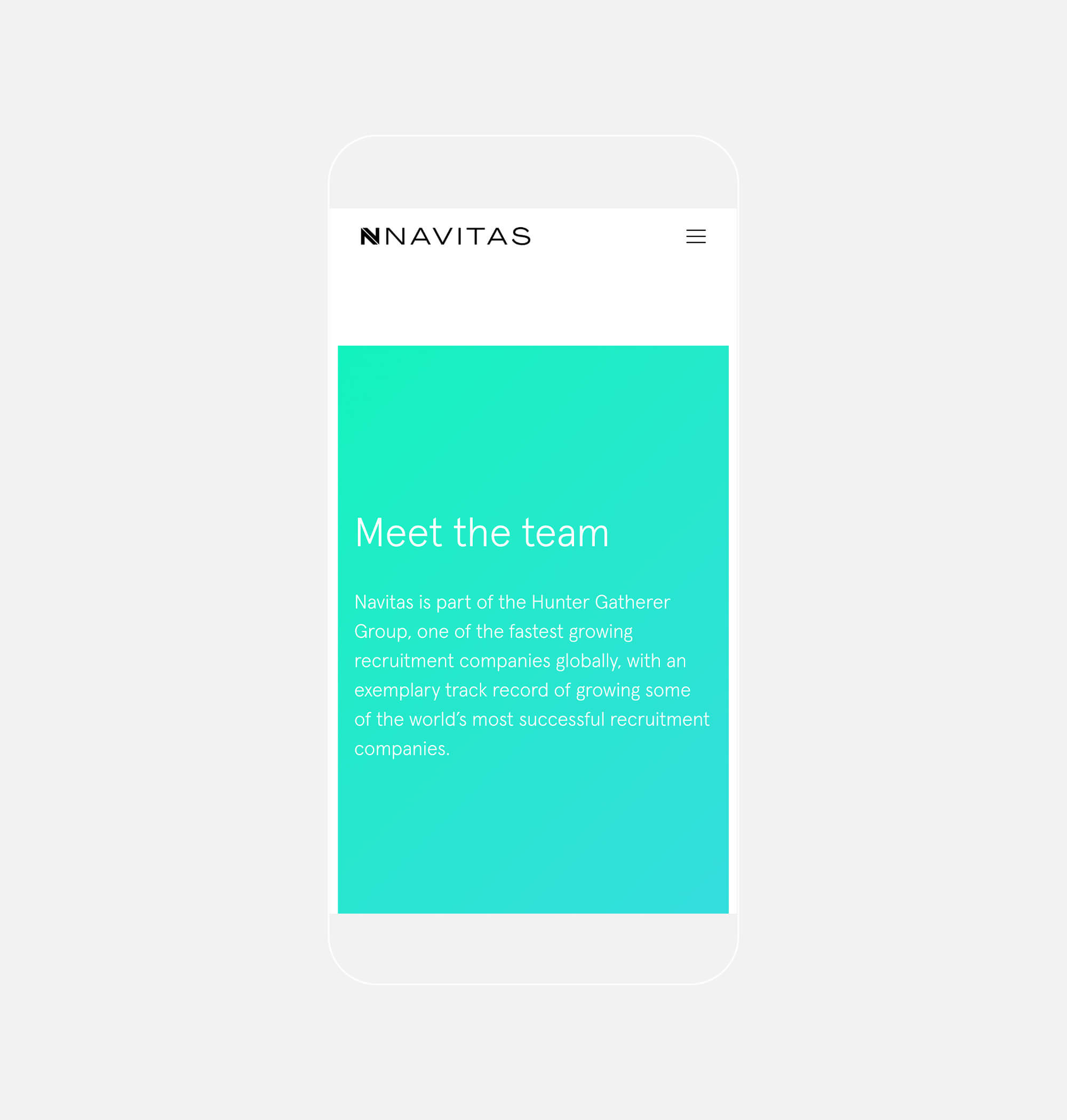
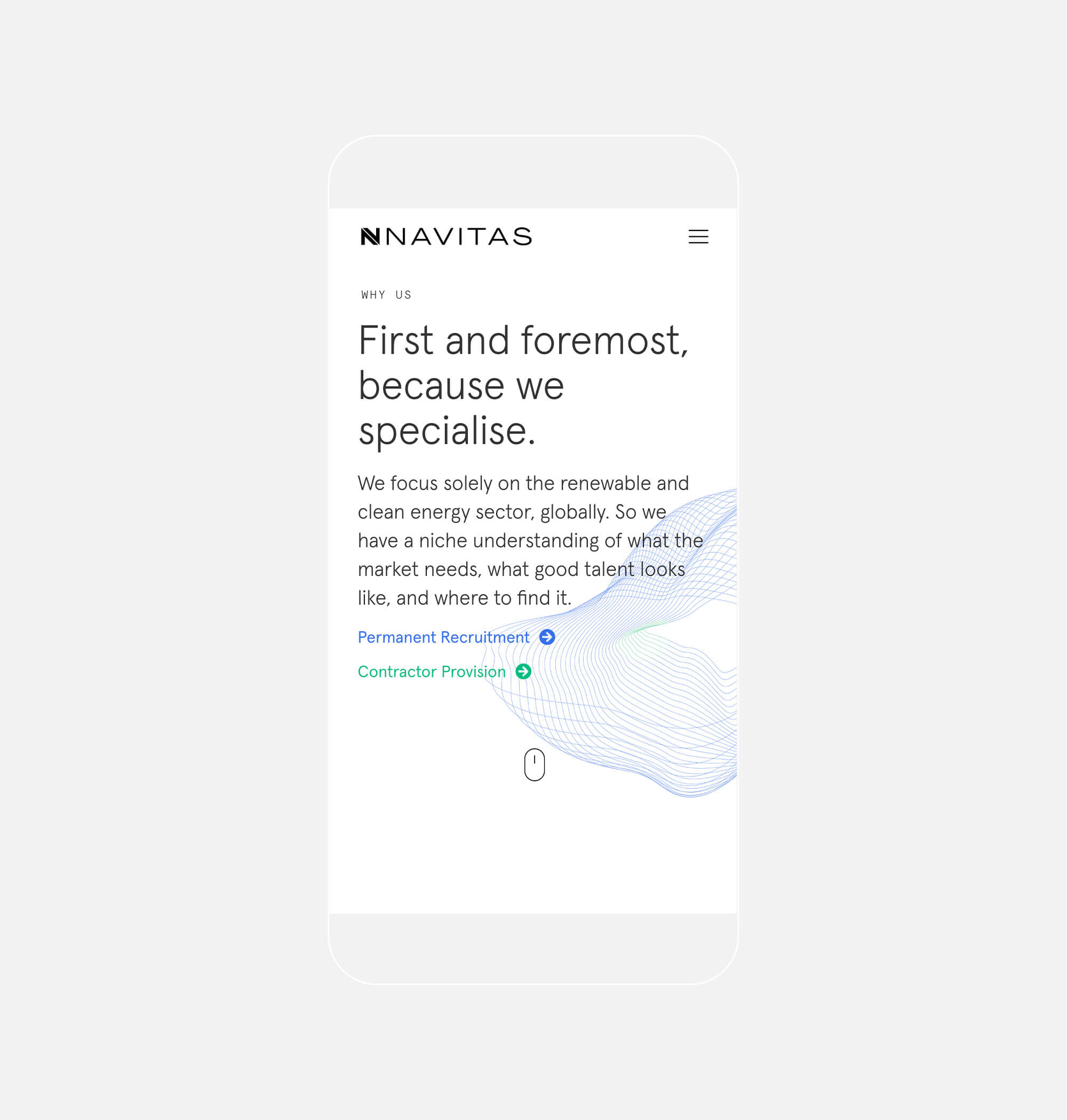
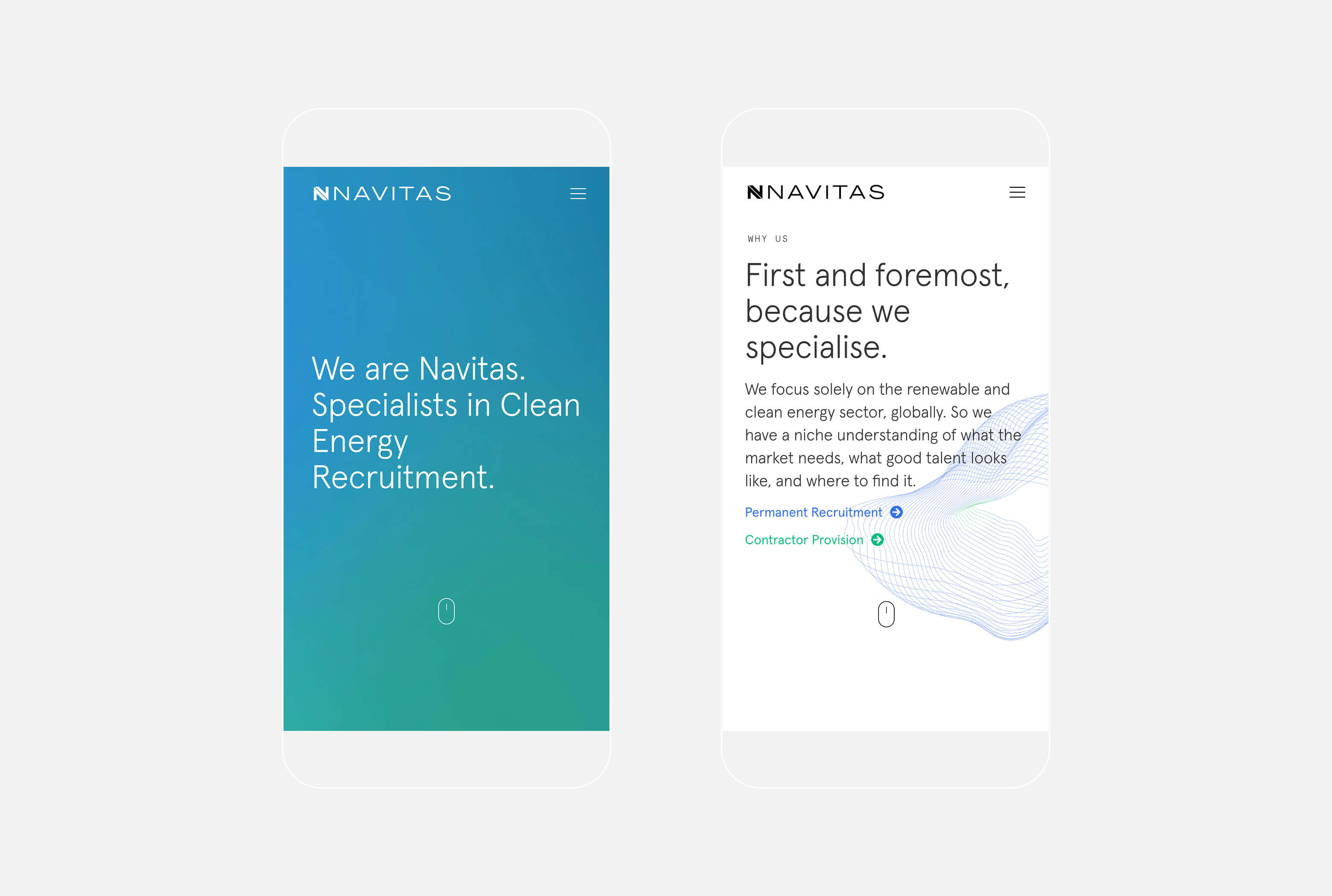
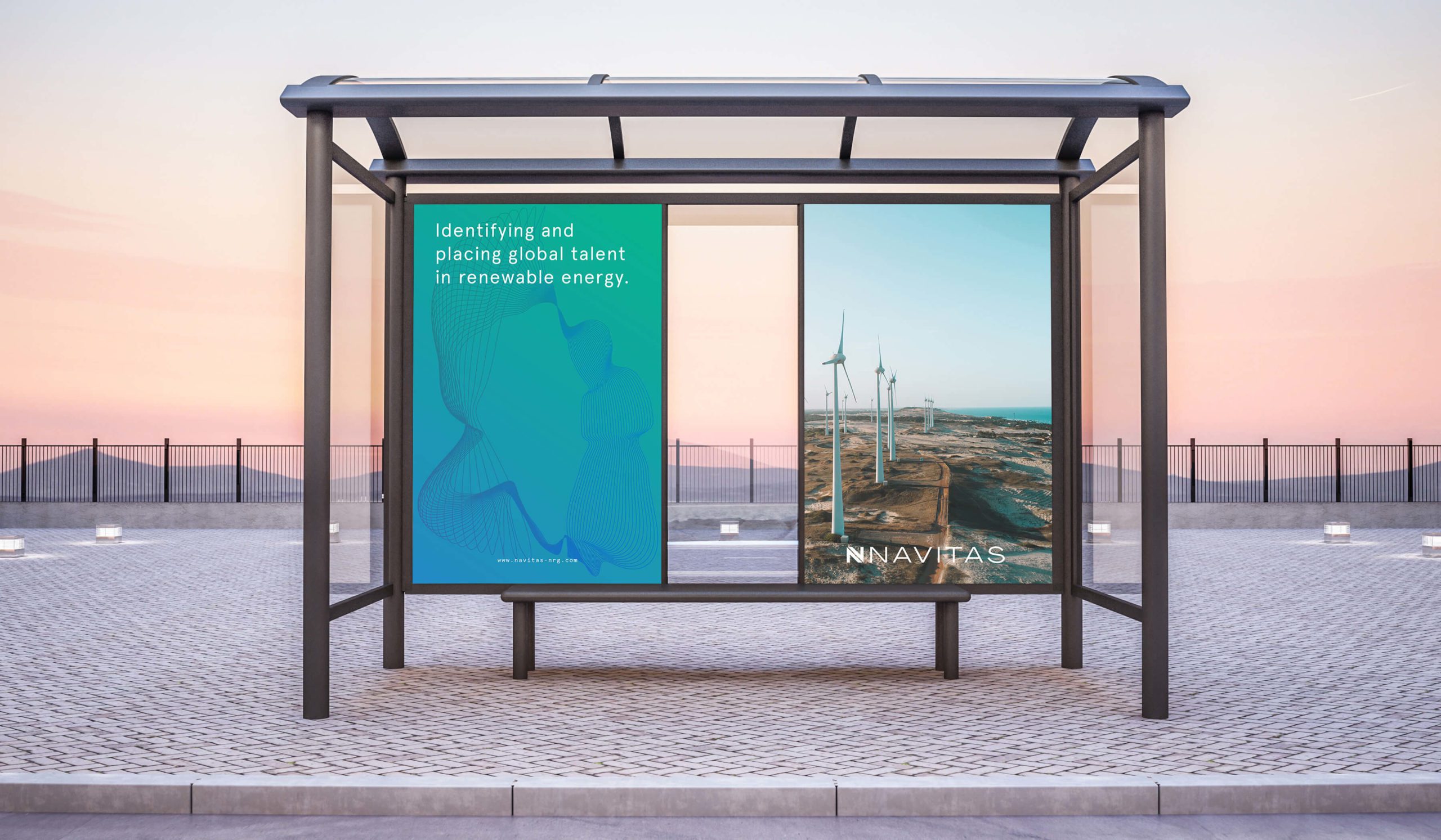
Navitas as specialists in clean energy recruitment. They are committed to accelerating the transition to a cleaner energy future by identifying and placing talent in organisations worldwide that share the same commitment.
Having previously worked with members of the Navitas team on branding and marketing projects, we were approached to help create a visually engaging brand and website that would elevate their messaging and create a dynamic, forward-thinking, and expressive design.
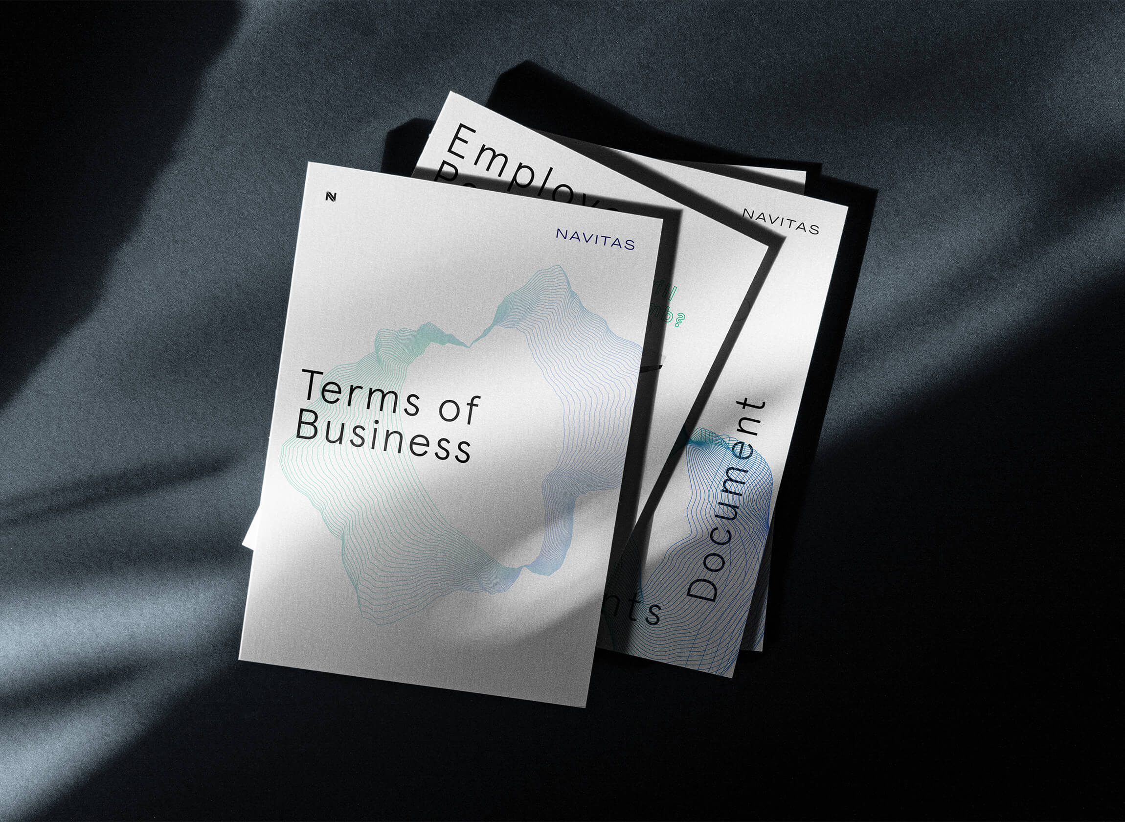
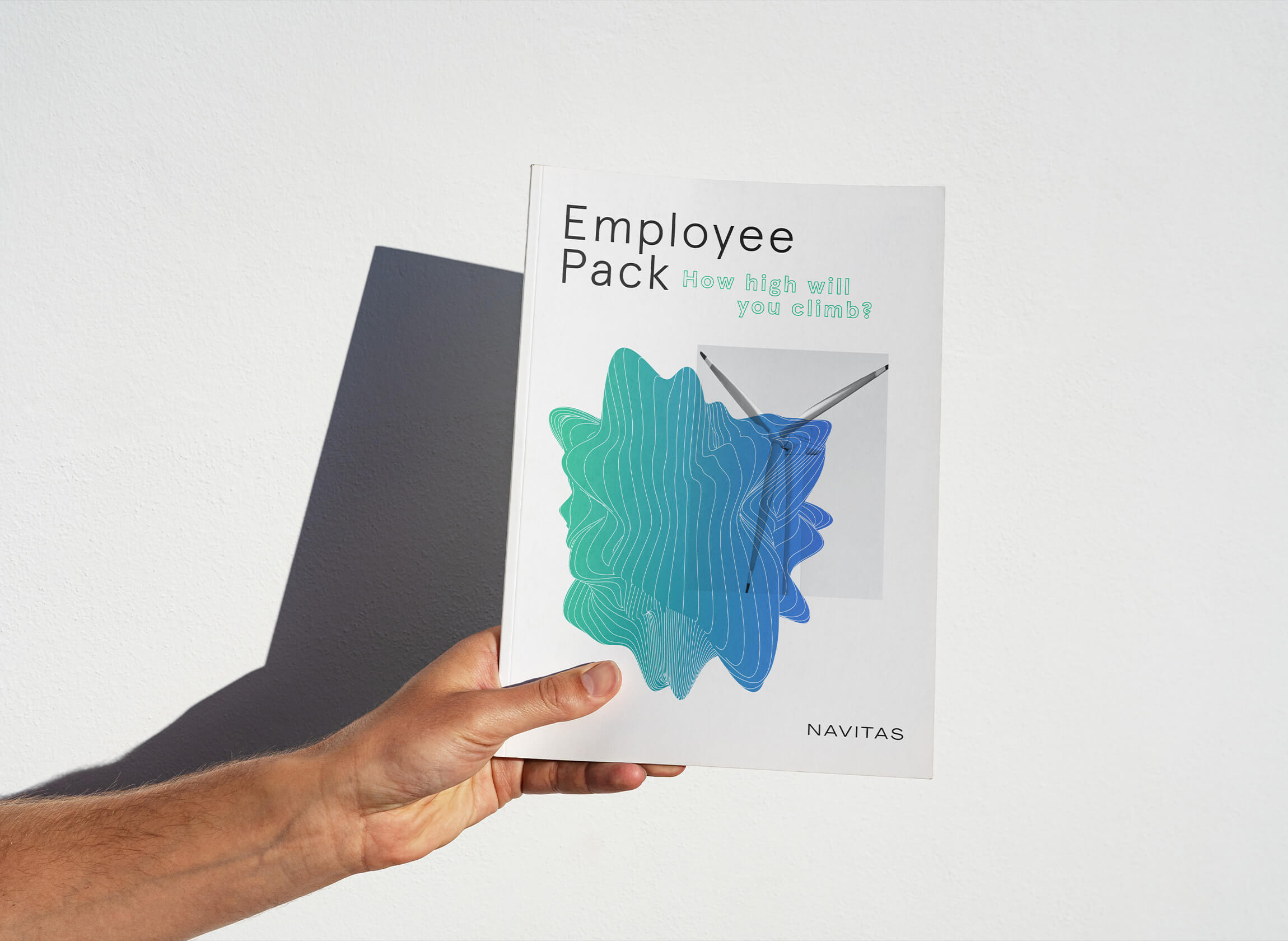
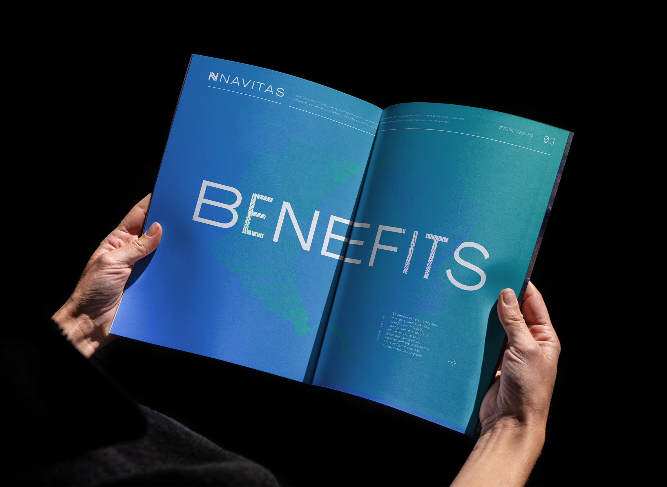
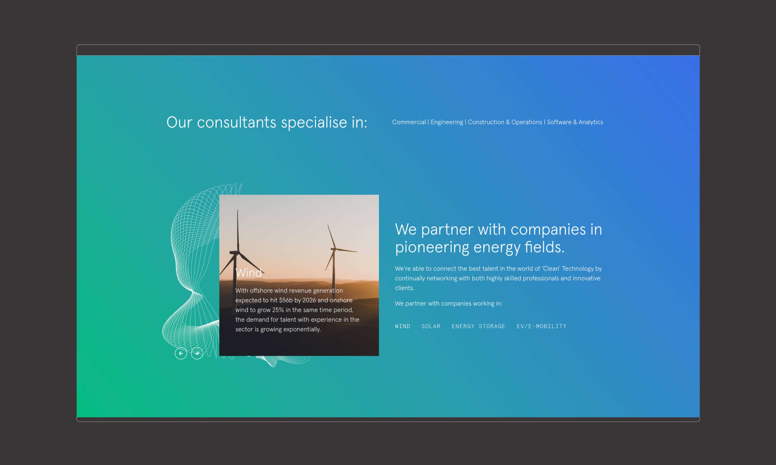
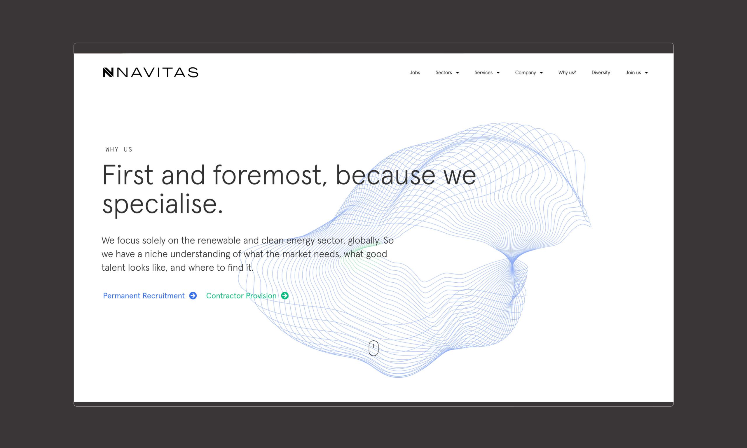
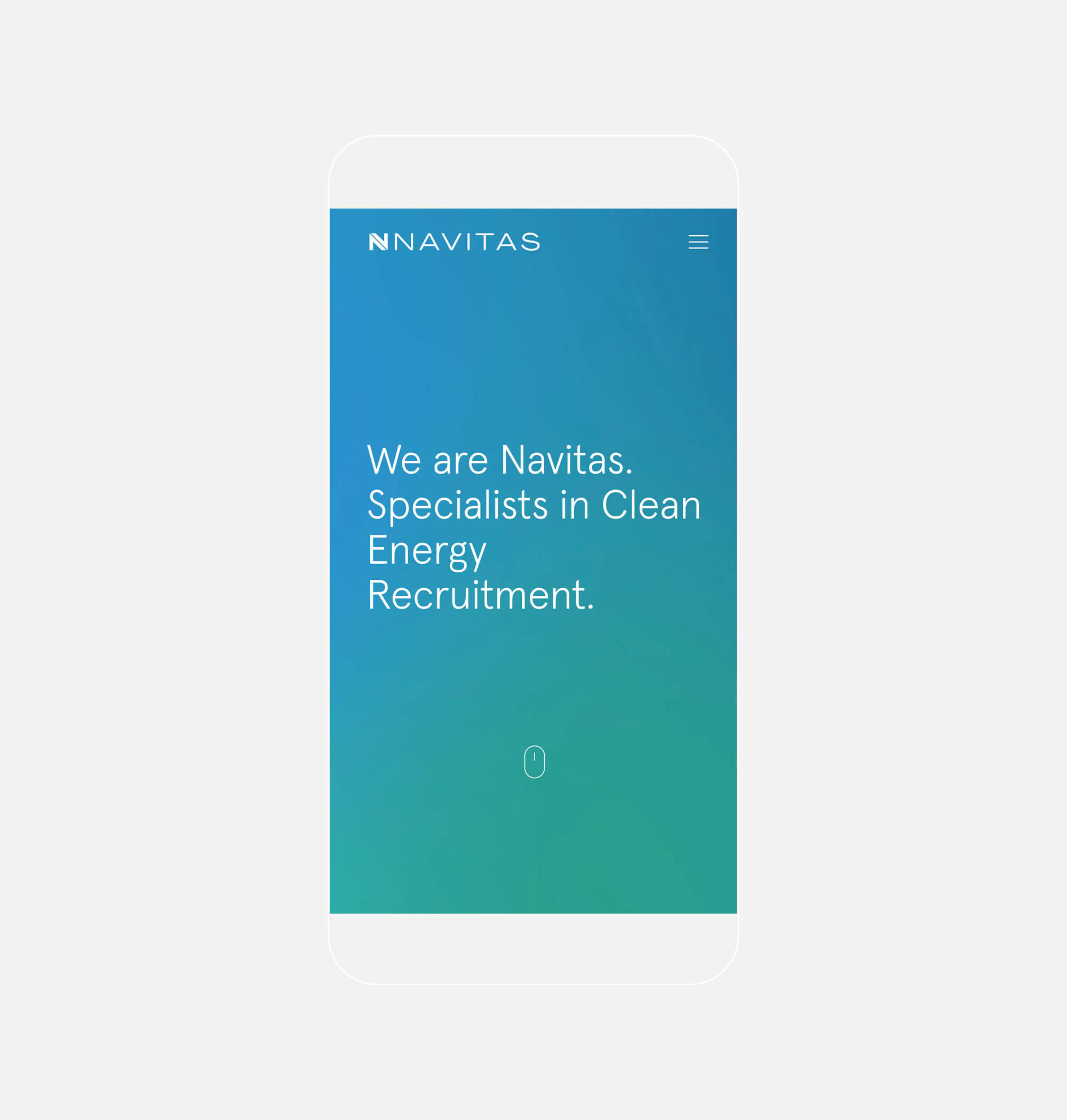
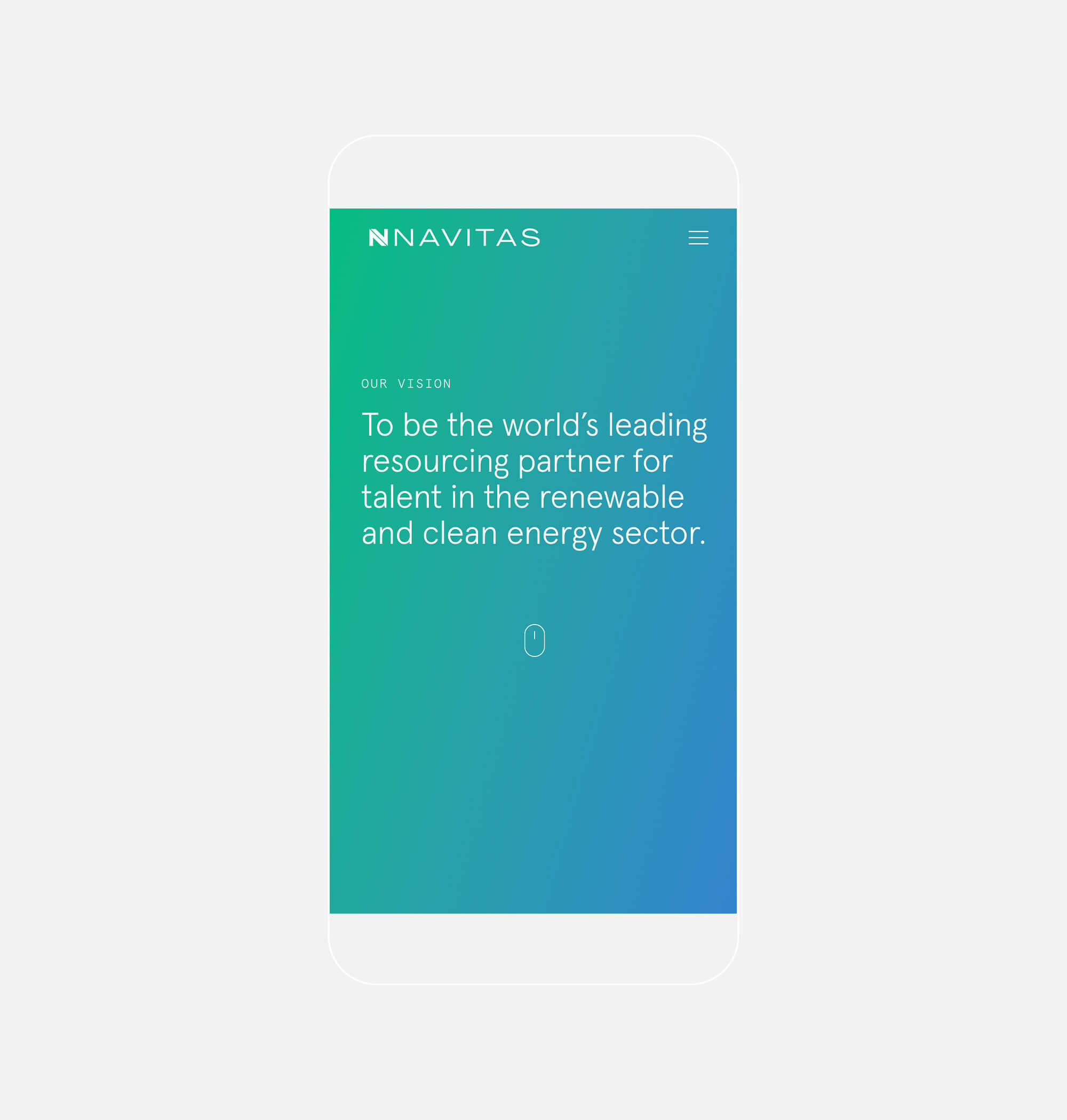
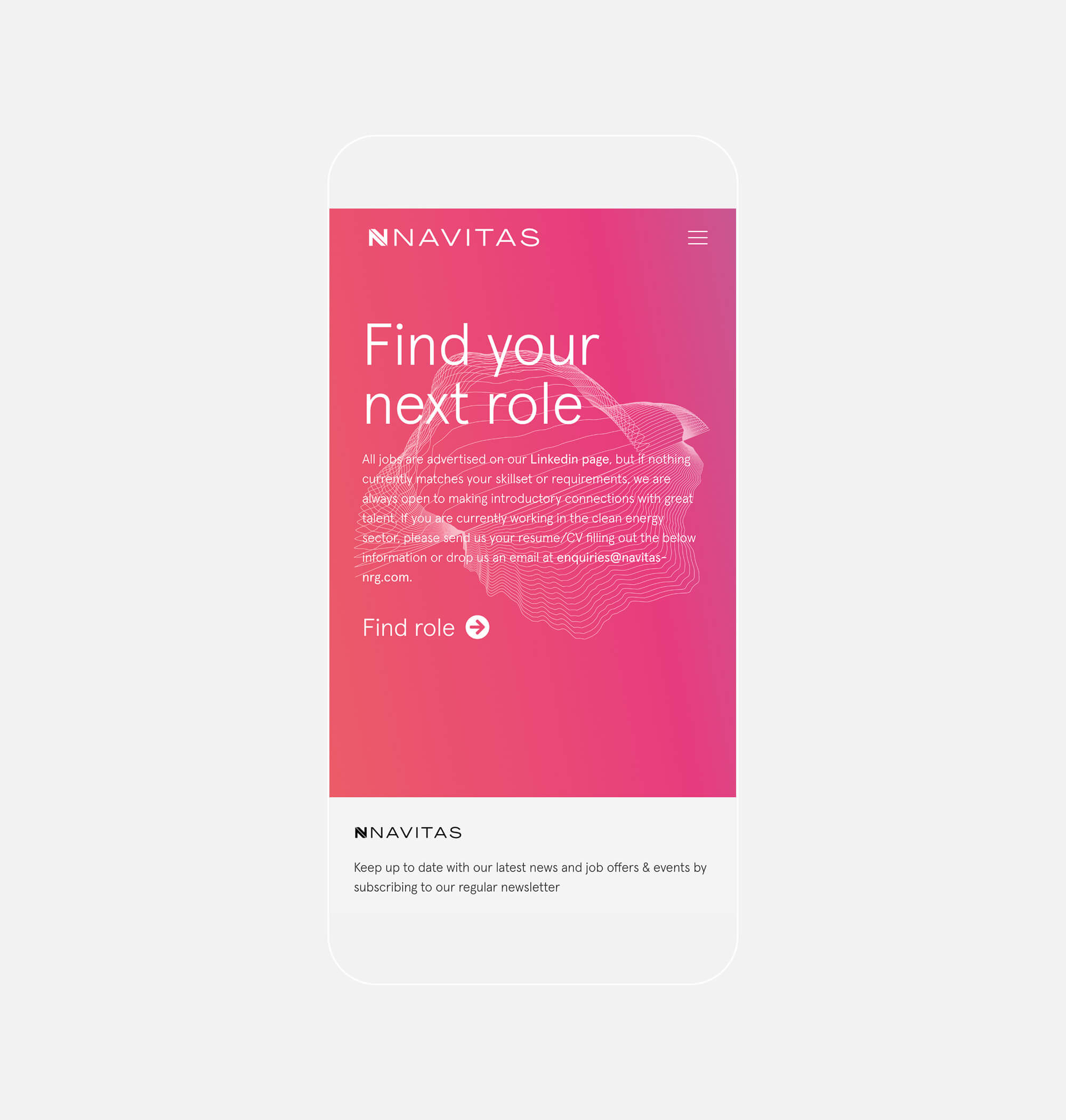
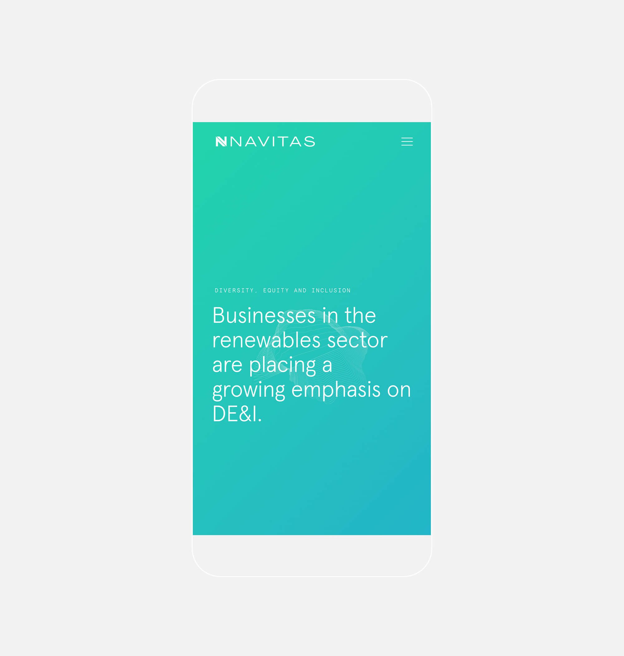
The concept centred itself around hypermodern and contemporary brand styling. Utilising a bold and vibrant palette combined with a range of textural images and graphic elements that lend depth, tactility and energy to the identity. The brandmark and logotype were inspired by two free-flowing forms coming together, symbolising their industry experience and interaction with both clients and candidates. The confidence of the brand was articulated through the bold, geometric and structured design, creating a mark that is instantly recognisable.
The brand mark celebrates the letter ‘N’. It utilises the bold structure to create a shape that subtly houses two directional arrows, highlighting the renewable link with the company and industry. A vibrant and bold palette contrasts against the delicate logotype adding personality and character to the identity, giving the identity versatility in its application. The brand visuals have drawn inspiration from two key areas; the textures of nature and Maxwell’s laws (the founder of electromagnetism and instrumental in opening the floodgates to the modern technology we have today). These graphic visuals lend a sense of dynamism to the identity, allowing it to be turned up or down depending on the content. The concept flows naturally across print and digital media, providing a consistent and confident feel.