Robyn Uppercase Logo in White

Piper Physiotherapy

Services: Brand Strategy, Brand Identity, Website Design & Print Design

Working in collaboration with Kath Piper, an experienced and well-respected physiotherapist, we crafted a flexible and modern brand & website design that would reflect her passion and values.

Primary brand logo on ballerina image
Inspired by historical origins but modernised to reflect contemporary practices.

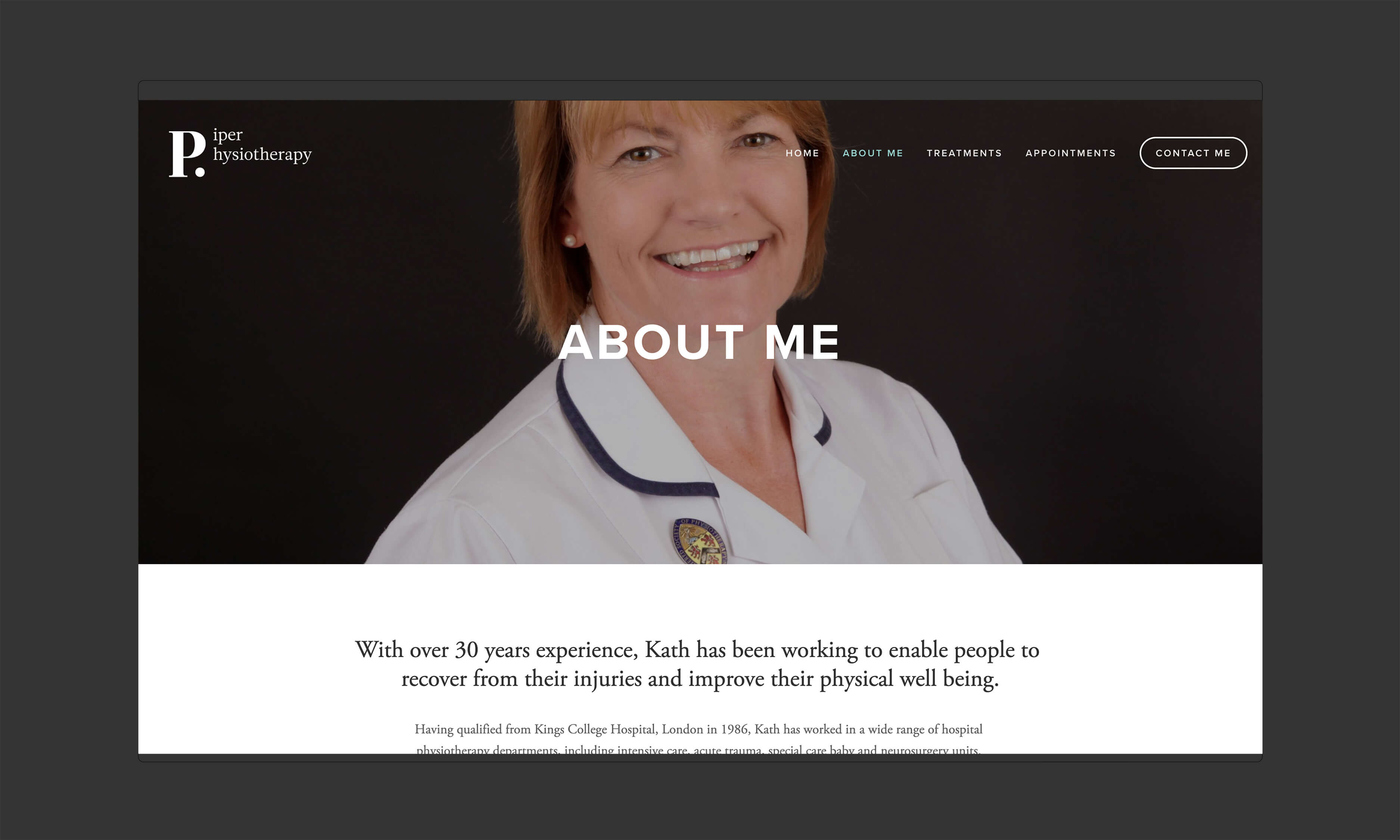
Kath Piper is an established and respected physiotherapist based in Market Deeping. Kath centres her practice around being kind, professional and confident - focusing on putting her clients at ease, and making the treatment process smooth and efficient.

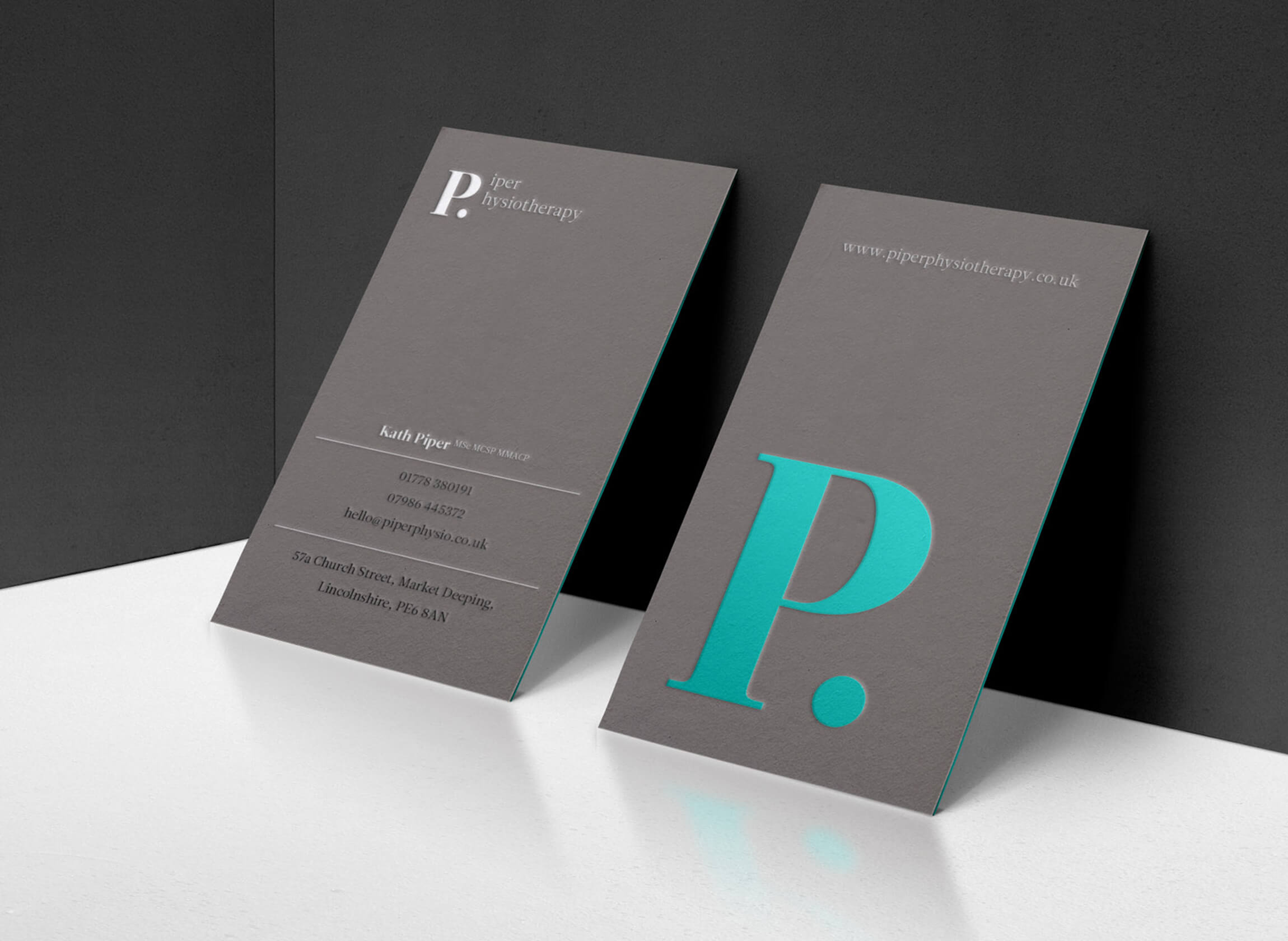
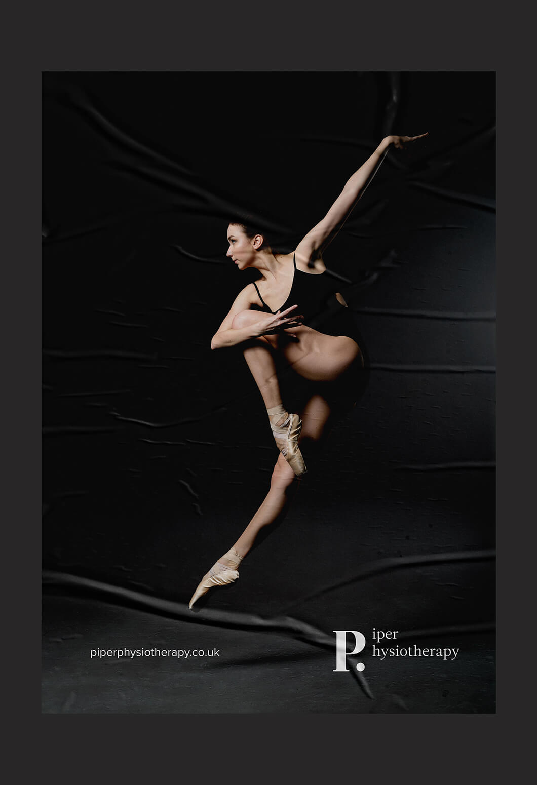
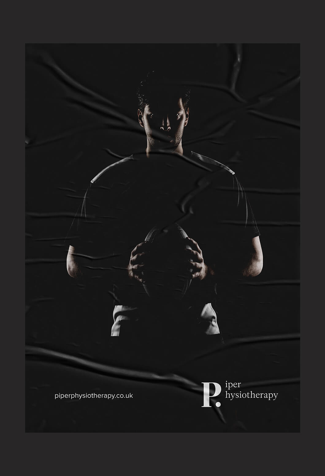
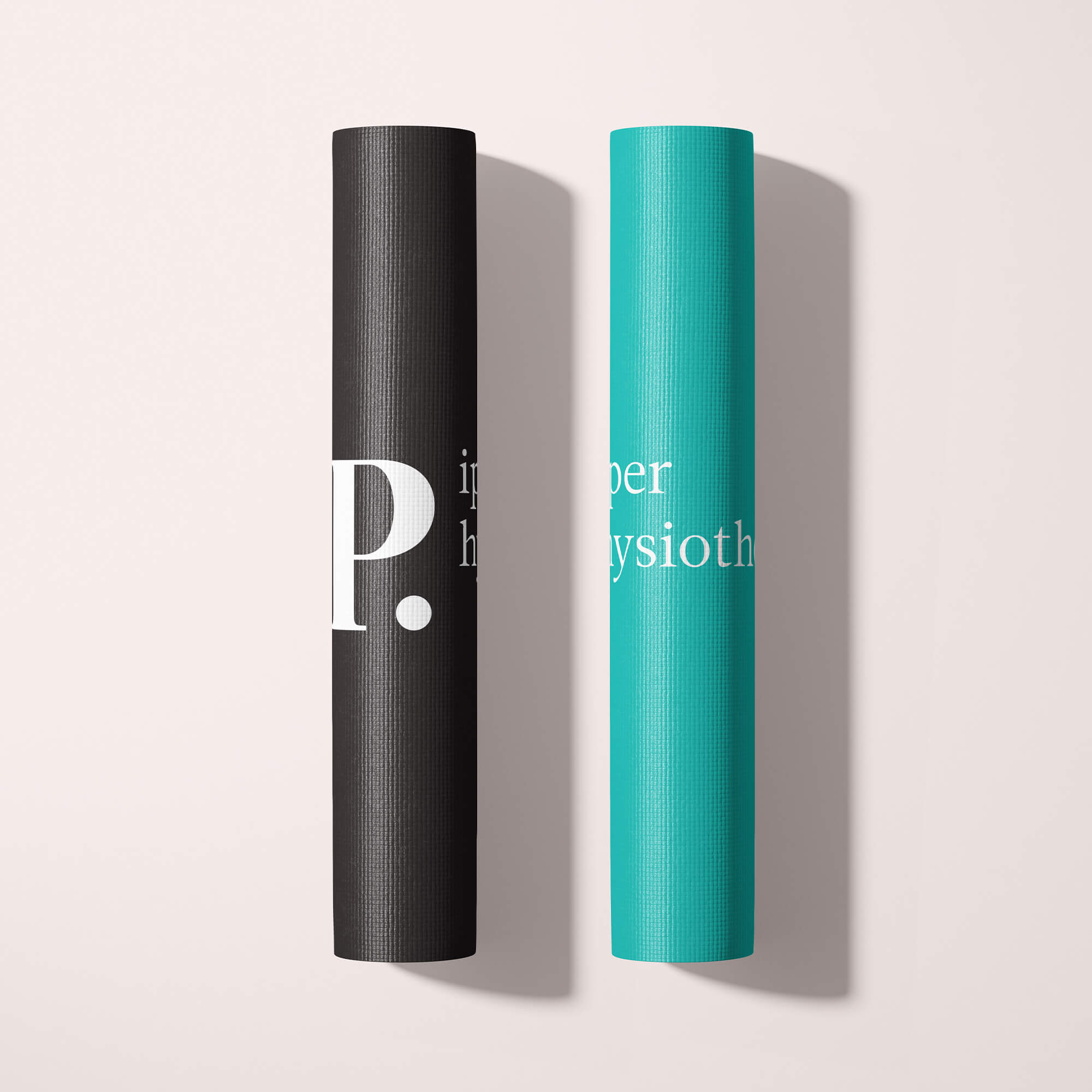
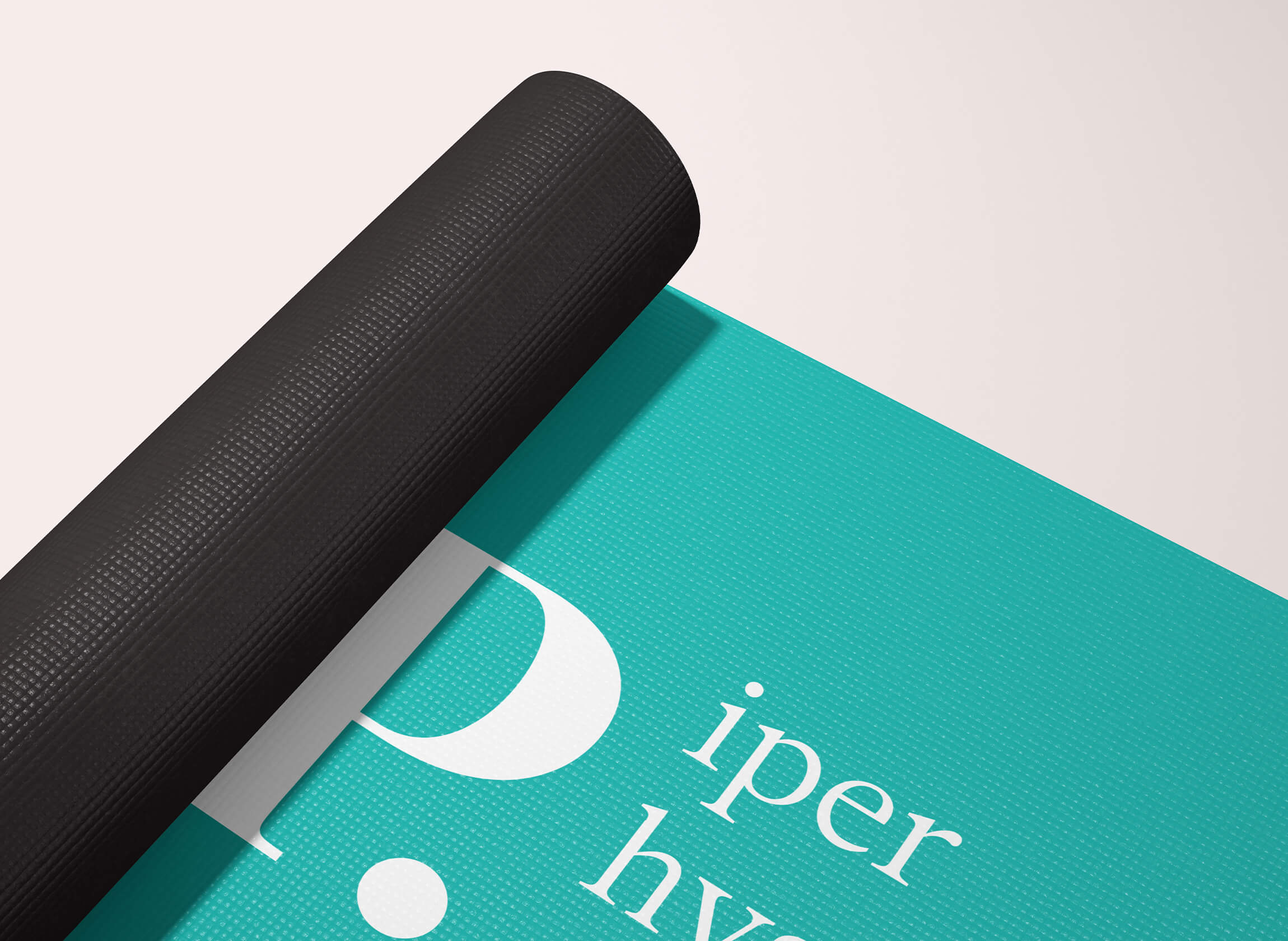
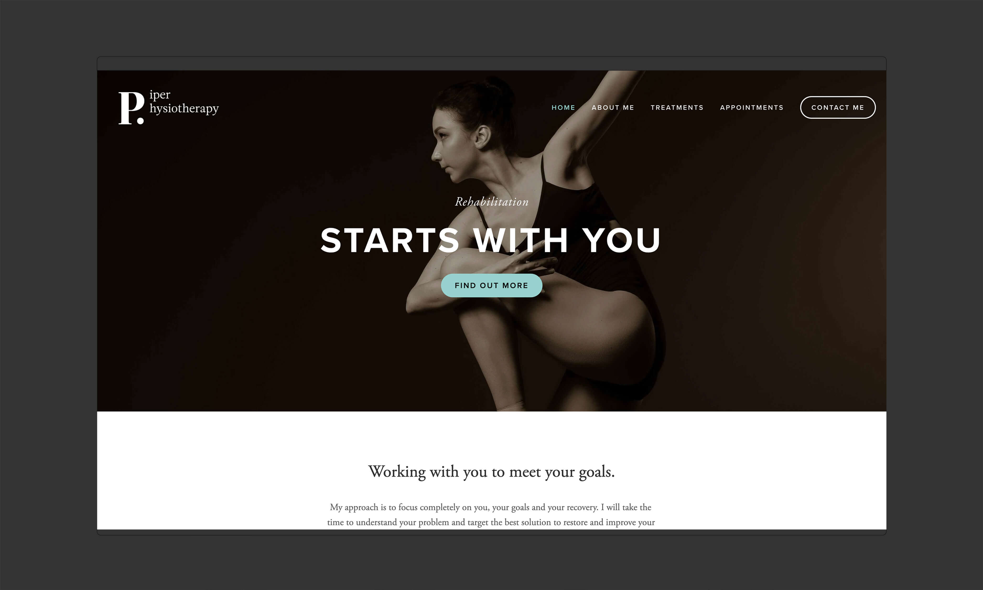
When it was time to create her new brand identity, the brand needed to portray these values in a clear, engaging and approachable manner. The concept has taken its inspiration from the origins of physiotherapy, specifically the physiotherapy journals in the 19th century and their typography. The design portrays a traditional and established feel through a clean and uncluttered design. The aesthetic conveys a confident brand while retaining an approachable feel through sophisticated imagery and a dynamic fresh colour palette.

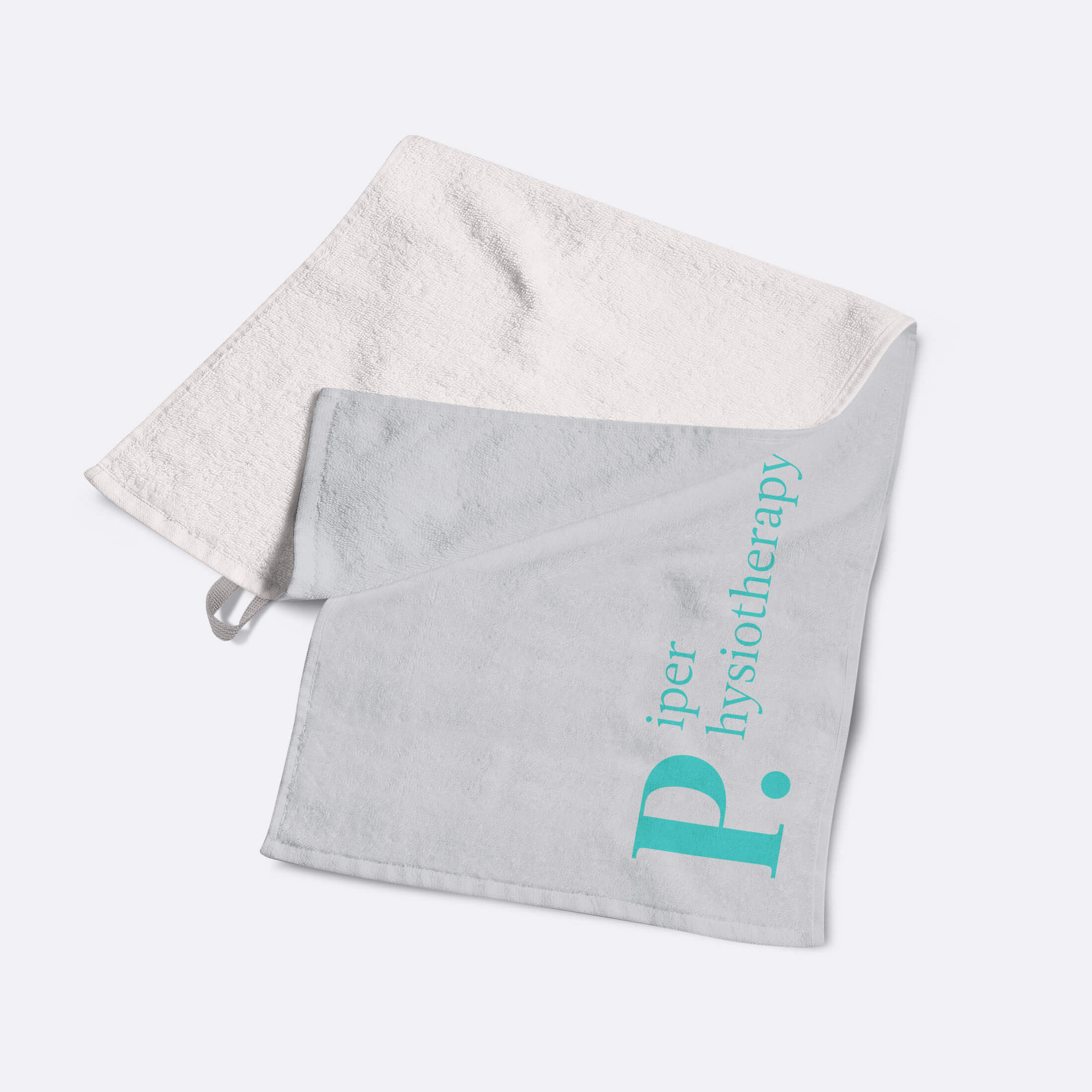
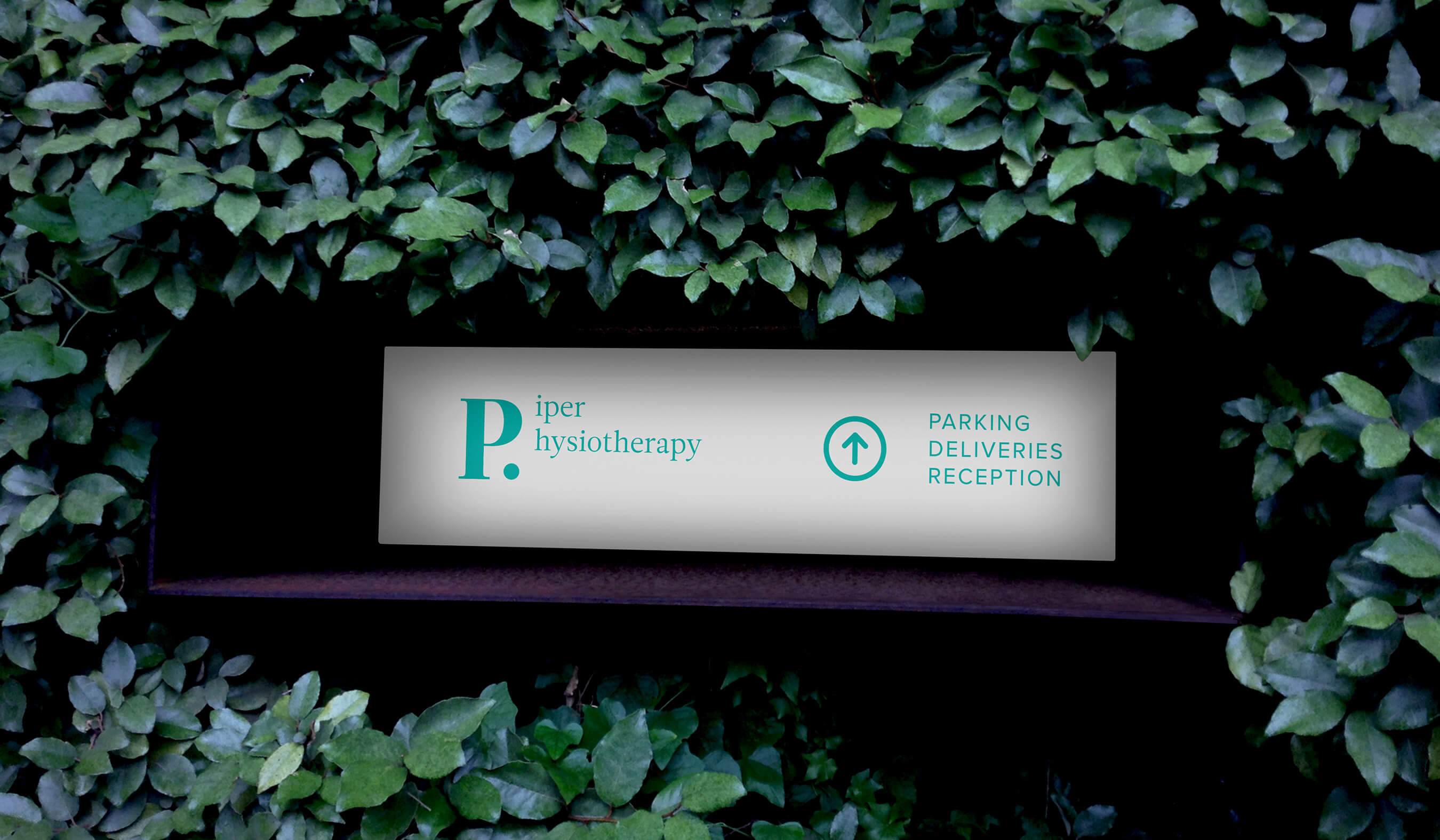
The logo was been designed to be flexible enough to work across all media; print materials such as; stationery, certificates, environmental signage such as their clinic displays and digital collateral.

Business Cards for Piper Physiotherapy
Physiotherapy advertising poster
Personalised brand towel for physiotherapy brand
Branded exercise mats
Branded exercise roll mat for physiotherapy brand

Clean and uncluttered website to maintain a minimalistic and refined design aesthetic.

When you're working with a wide range of customers and demographics, you have to ensure that your website can cater to each one's needs. This can be challenging when there's a lot of content to cover, but Kath Physiotherapy's website design is both minimal and responsive, making it simple for people to find what they're looking for. The site was designed to mirror the brand's values - its minimalism and refinement - in an effort to help clients feel at ease. The design needed to be responsive so that users could view it on desktop and mobile devices. We used clean typography and plenty of white space to make the site look as open and uncluttered as possible. The use of photography makes the site stand out while also helping users see visual representations of some of the therapy options available at Kath Physiotherapy.

Physiotherapy brand wayfinding in car park

Next Project:

Brooks & Partners
Accountancy firm brand identity and signage
The Wine Bar
the-wine-bar-mobile-header

Next Project:

Have a project you'd like to talk about?