Robyn Uppercase Logo in White

Testable

Services: Brand Strategy | Brand Design | Print Design

We were approached by the team at Testable, an all-in-one behavioural research software platform for universities, researchers and businesses around the world, to refresh their branding to better position themselves within the market and articulate their company's services, vision and purpose.

Stationery design for software platform brand
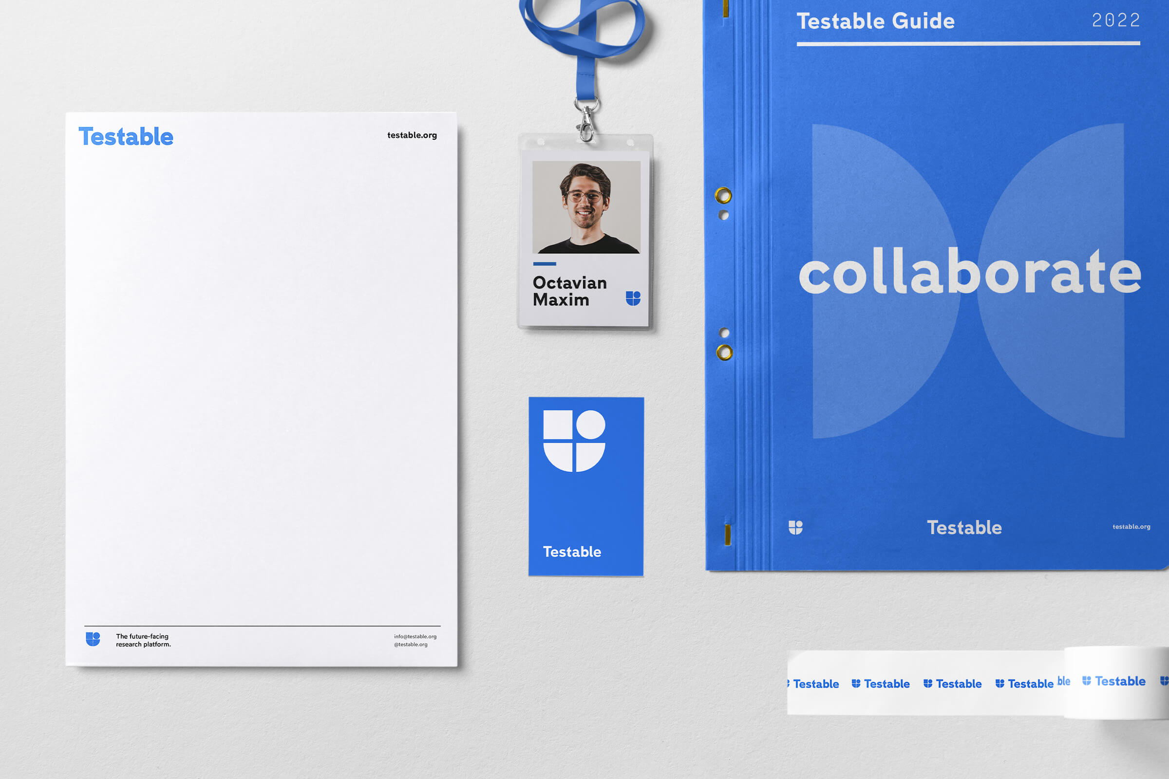
Modern yet classical design full of playful personality and professionalism.

Testable started with a vision to provide a simple and easy-to-use software platform that allows researchers, universities and students to build effective behavioural experiments that deliver tailored and reliable results.

The aim was to remove the hassle of doing their own digital experiments through learning to code and develop their own software. They developed a streamlined digital software platform solution that simplifies the process and reduces the hassle, allowing professionals to focus on the content, results and data and design experiments confidently.

The Testable brand and product have developed and evolved over time to tailor the experience further and create a dynamic marketable software platform product that fully supports academics and their research. However, the brand needed to articulate its position better on how it helps researchers and communicate its key selling points such as; autonomous control, streamlined process and a research software platform created by researchers who actually use it—working to further its position within the market and speak more clearly to its audience.

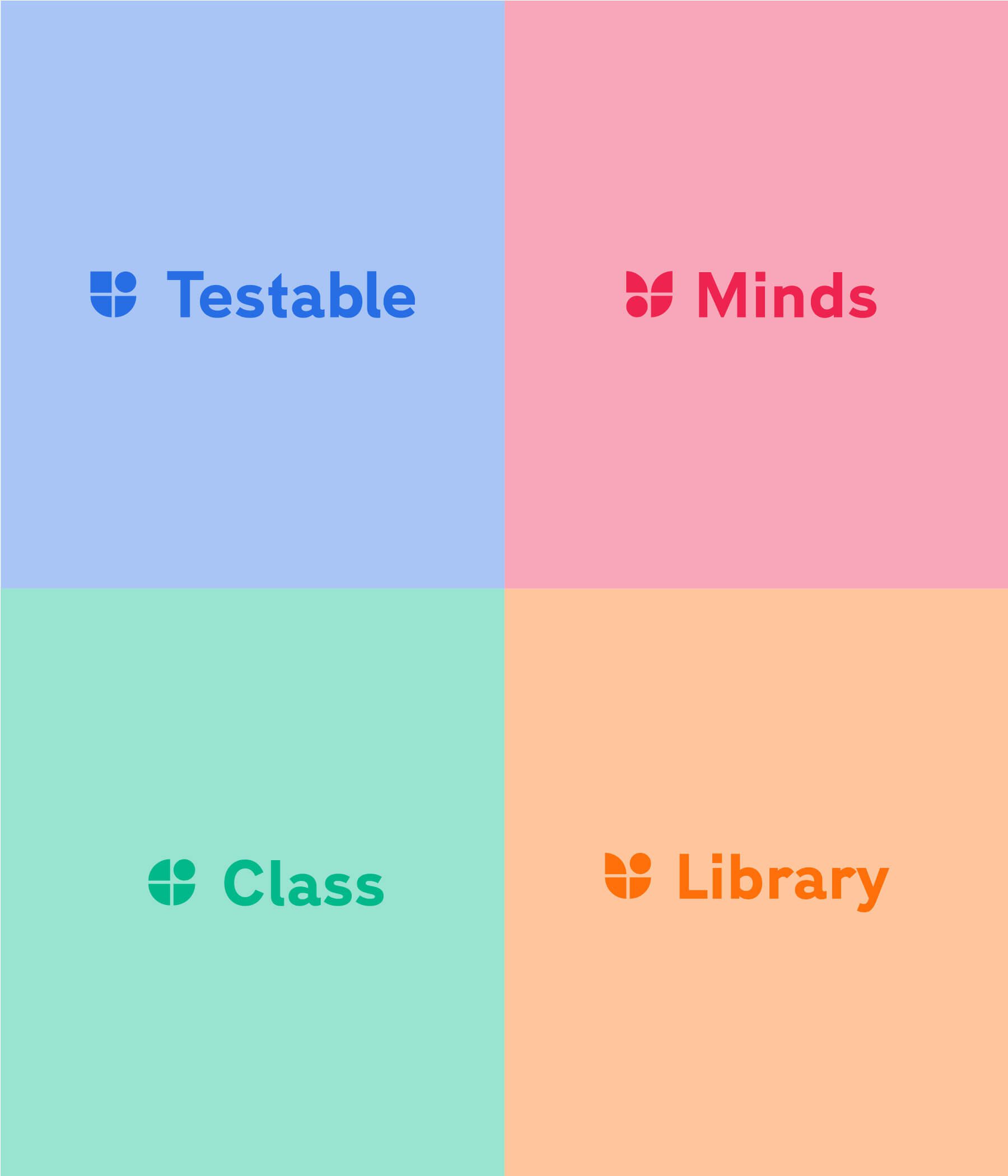
Partnering with the Testable team, we spent time developing their brand strategy through multiple workshops to map out their unique qualities, messaging, and tone and develop a consistent overarching brand persona that would support not only the main Testable offering but also their sub-brands so that consumers would instally recognise the business. 

Testable sub brand logos
Brochure design for software platform
Folder and marketing pack design for software brand

Artistic expression and psychology have been used throughout history to explore different ideas, whether emotional connection through colour theory or the more complex expression of synaesthesia, for example.

Taking the strategy framework, we then crafted their brand identity to embody their key values. These values formed the cornerstone of the concept. Artistic expression and psychology have been used throughout history to explore different ideas, whether emotional connection through colour theory or the more complex expression of synaesthesia, for example. The concept takes inspiration from this cross-over and revolves around Bauhaus's iconic era in design history. Bauhaus explored, experimented and distilled down design fundamentals through psychology and understanding, creating a foundation to build from. This is mirrored in the thinking behind Testable, simplifying a complex topic and system down to enhance the consumer's research. With this in mind, the third concept explores this narrative and thinking through a simplified and modernist design that is both playful and mature in its application. The design centres around a logotype and mark that works simultaneously and on its own. Giving the brand freedom in its application. The brand mark creates an abstract 't' shape, taking inspiration from the modernist Bauhaus approach, giving a simplified form to a complex shape.

Custom iconography for software brand

Further enhancing the inspiration to Bauhaus, the colour palette focuses on a single primary colour bit with a warmer tone to give an approachable and open tone. The primary red/orange colour is soft and gentle, giving the identity contrast without overwhelming. The simplicity of the palette further enhances the brand's consistency and uniformity in its application, enhancing its recognisability in the industry. The brand visuals follow the logo marks lead, creating diverse shapes from the gradual system. These shapes and icons can be used singularly or as part of broader patterns giving the brand a consistent theme and structure. The identity has a modern yet classical design, lending the brand credibility and professionalism and showcasing a playful personality that engages and understands the consumer.

Next Project:

KVIST
Brand stationery including letterhead and business card for KVIST interior design brand
More Travel
More travel business card designs and print

Next Project:

Have a project you'd like to talk about?